Cleancult Rebrand
ABOUT OUR LOGO
When rebranding the Cleancult logo, we wanted to pull aspects of being both clean while still being classicly cultish.
The star in the counter of the “a” representing cleanliness, and the blacklettering tying the brand back to cult aspect. Of course, since we wanted to convey a sense of community, the blacklettering was softened giving the logo a more approachable and friendly appearence.
Graphic Elements In USE
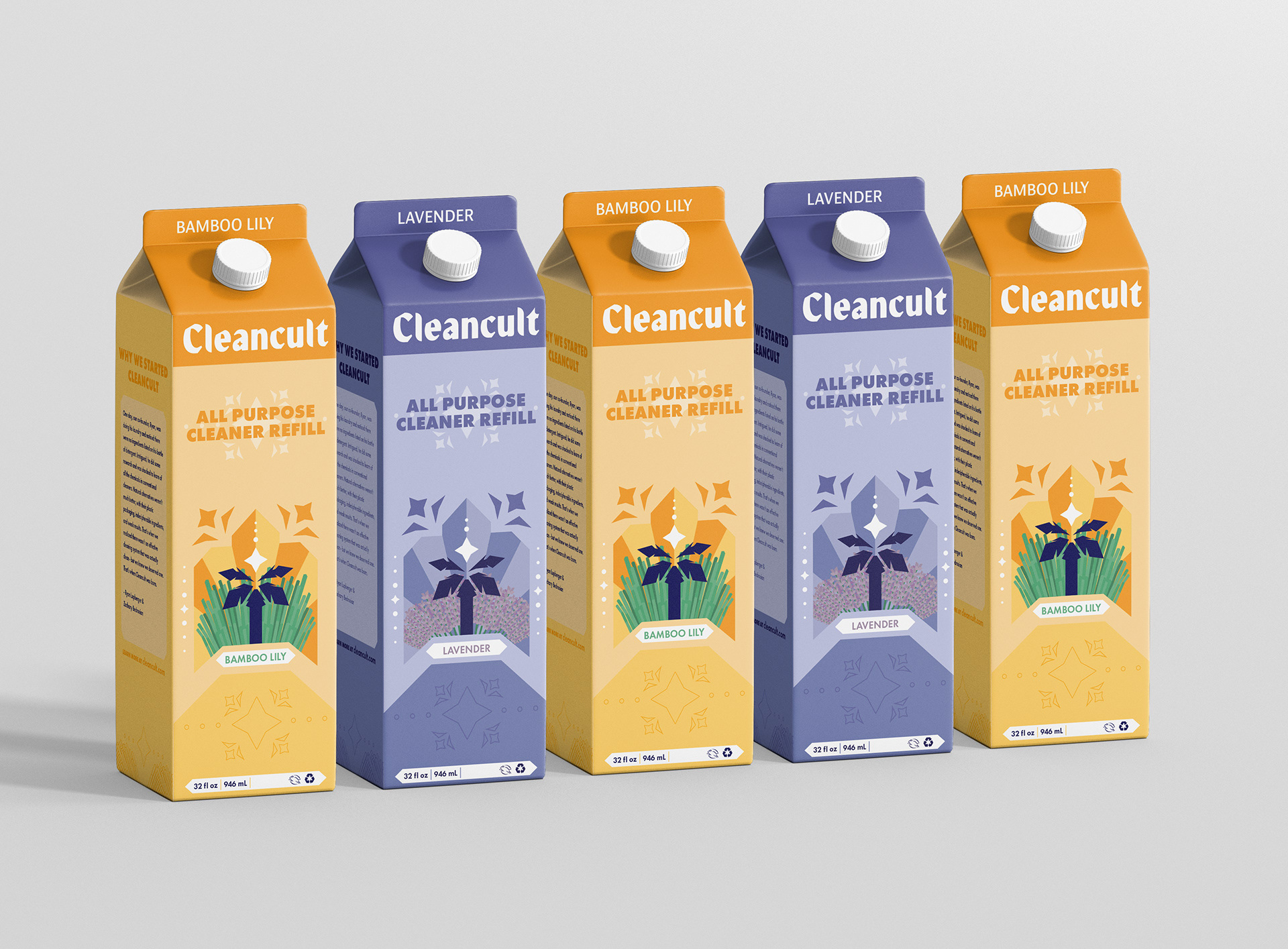
With the usage of clean strokes and lineless graphics, the religious undertones of the Cleancult brand are shown through the stylistic choice of Art Deco themes. This, in turn, references the cleanliness of the product within.
On the packaging of the product, tropical themes, such as the palm tree and the bamboo surrounding it, reference the brand’s origins of the product and where it is produced-–Puerto Rico. It's here, on the palm tree, where you can find a star with rays of light radiating from it that alludes to the Cleancult product itself sprouting cleanliness.